Logo, color, typography, voice, and applied collateral — built as a coherent system that holds up on a 5cm pouch label and a 50ft trade show wall. For product brands and DTC studios serious about coherence.
When founders ask us for branding, they almost always ask for a logo. When we deliver branding that nails the logo, the brand still fails on shelf. The two facts are connected.
After eight years and several hundred product-brand identity projects, the leverage isn't in the logo. It's in the system: the color, the typography, the voice, and the applied rules that make your brand feel like itself everywhere — including the touchpoints you haven't designed yet.
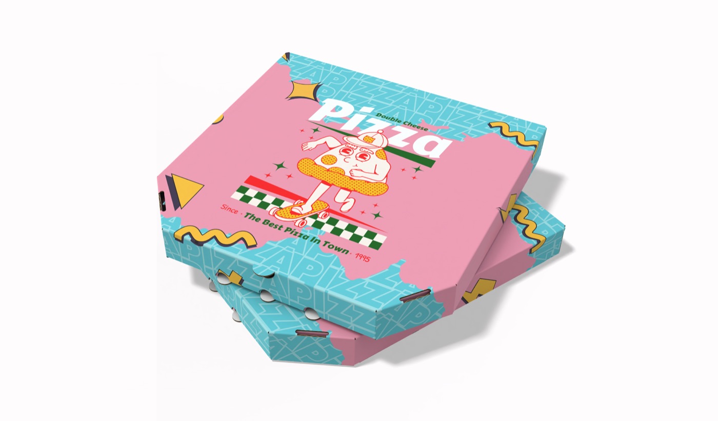
Buyers don't recognize brands by their logos at retail. They recognize them by color and shape. Coca-Cola is the red can. Method is the bottle silhouette. Lush is the matte black tub. Pick two anchor colors that the brand will own — unique inside your category, legible at distance, printable in CMYK.
Custom illustration is expensive and rarely scales. Distinctive typography — a serif/sans pairing that's unmistakably yours — does scale, costs nothing per SKU, and reads at every size from a 5cm pouch to a 5m banner.
Tone of voice is usually treated as a brand-strategy add-on. It shouldn't be. The way the brand talks on the back of the pack changes how the front of the pack reads. We brief copy and design together — never sequentially — and the resulting brand feels coherent in a way most brands don't.
If you can't describe what your brand sounds like, your packaging is doing only half the work.
Primary mark, secondary lockups, monogram, and the smaller marks every brand actually uses (favicon, app icon, social avatar).
Anchor and accent colors with full production specs — Pantone, CMYK, RGB, HEX — plus accessibility-checked combinations.
Display and body type pairings tested at every scale, with paragraph styles and a clear hierarchy.
How your brand sounds — built alongside the visual identity, not bolted on after.
A 12–20 page guide your team can actually use. Not a 200-page bible nobody opens.
Cards, letterheads, decks, signatures, signage, packaging — every applied surface we discover during the project.
A logo is one artifact. Brand identity is the system around it — color, type, voice, applications, and rules that make your brand feel like itself across every touchpoint. We always sell the system, even when clients only ask for a logo.
Mid-range brand projects run 4–6 weeks end to end. Larger systems with full applied collateral run 6–8 weeks. Discovery and direction take 1–2 weeks; refinement and applied design take the rest.
Yes — and we encourage it. Re-brands that throw out 10 years of recognition usually fail. We map what to keep, what to evolve, and what to retire — most refreshes preserve 60–70% of recognition while resolving the issues that triggered the project.
We don't file trademarks, but we run an informal availability check before kickoff and your IP attorney can file with the assets we deliver. We're happy to work alongside your trademark counsel.
We pitch two confident directions — not three watered-down options. The decision usually comes down to which direction better serves the business strategy (premium vs accessible, established vs disruptive, etc), tested against worst-case applications.
Yes — packaging, web, and social design are all in-house at Runtym. Brands that take all four from us ship a coherent identity faster, with less coordination overhead. Discount available for bundled engagements.
Yes — every brand project ends with a 12–20 page brand guide covering logo usage, color, typography, voice, and applied examples. Designed to be usable, not impressive.