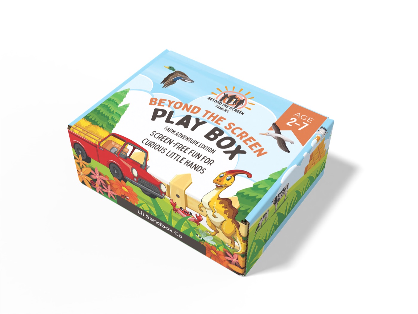
Packaging trends are usually a reflection of consumer mood — and 2026's mood is unmistakably done with maximalism. After three years of bright, busy, AI-art-inspired surfaces, the pendulum is swinging hard back toward restraint, material honesty, and packaging that feels like it was made by a person.
Five trends we're seeing across the briefs landing on our desk this year.
1. Material-first surfaces
Uncoated kraft, recycled fiber, soy-based inks — packaging that announces what it's made of before it announces the product. Brands that already had sustainable supply chains are leaning hard into letting the substrate be visible. Brands that didn't are scrambling.
2. Big serif, big numbers
Display serifs (DM Serif, Migra, Editorial New) at huge sizes paired with single-color illustration. Numbers — concentration, weight, batch — treated as headline typography rather than info-graphic afterthoughts.
3. Color blocks, not gradients
Flat color blocks reading clearly from across the aisle. Rainbow gradients on cosmetics, supplements, and beverage have visibly retreated. The brands moving fastest are using two or three flat colors with strong contrast.
4. Hand-drawn details
Tiny illustrative details — a hand-drawn ingredient, a doodled batch mark, a marginal annotation — that read as 'made by a human, not a designer in a hurry'. Best paired sparingly with otherwise restrained typography.
5. Honest claim hierarchy
Three claims maximum on the front face. Anything beyond that goes to the side or back. Buyers are tired of front-of-pack claim soup, and the brands stripping it back are seeing it pay off in shelf trust.
If your packaging refresh is on the 2026 roadmap, this is what we do every day — happy to send a free first-pass concept.